Summer Browner
Real Estate
Portland, Oregon — 2023
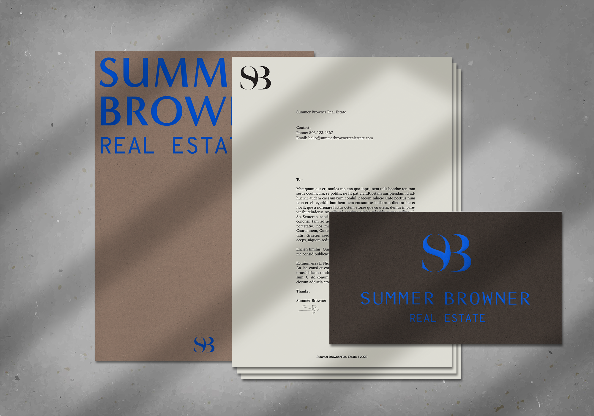
Brand Identity
Copywriting
Custom Typography
Merchandise
Print Collateral
Website Design


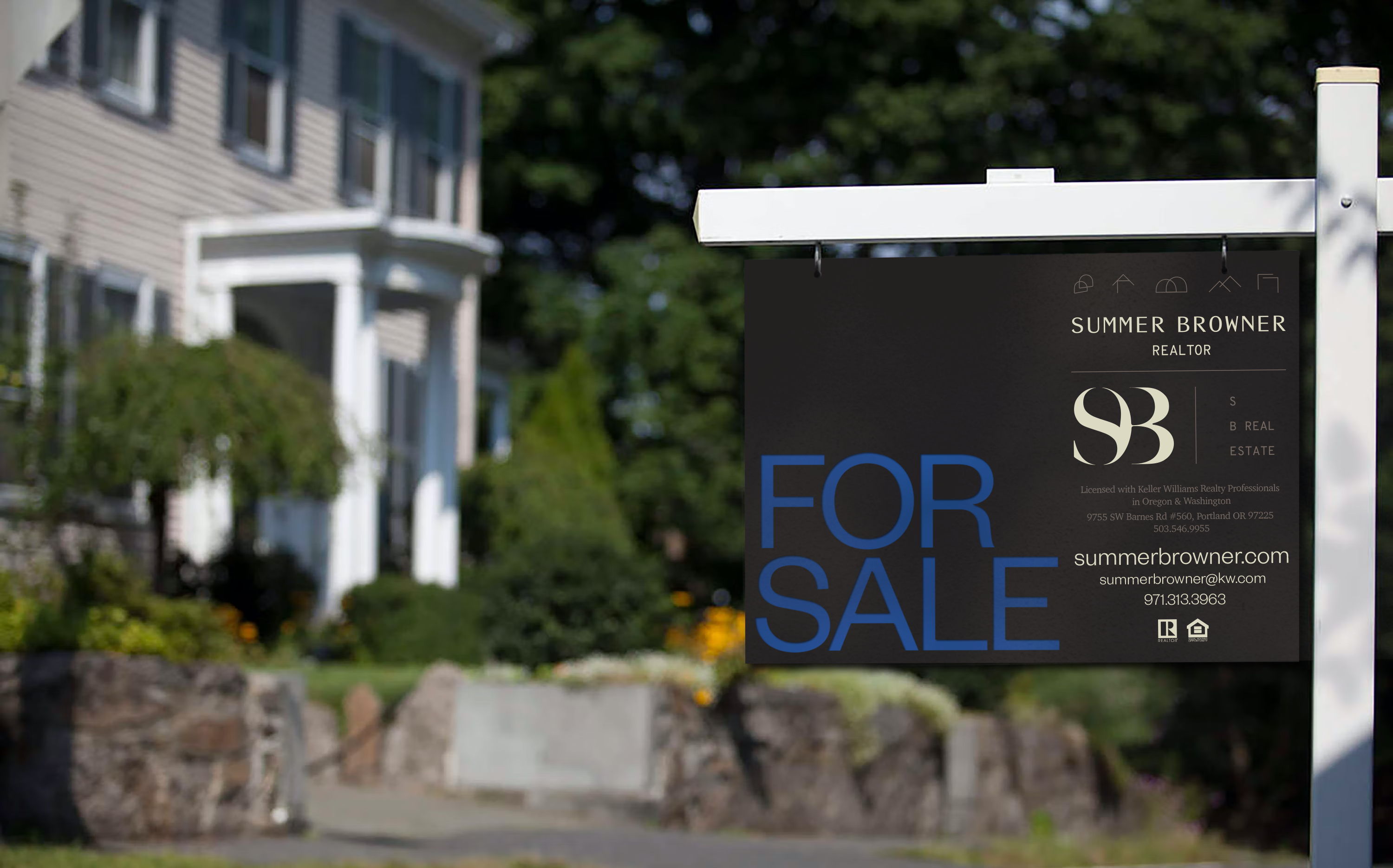
Summer Browner came to us looking for a sophomore album cover. Not “sophomoric,” but something that screamed, “I know what I’m doing— my numbers speak for themselves. My reviews are never less than 5 stars.” – without actually saying it. Summer had been slinging real estate in the Pacific Northwest for a decade and needed an identity that reflected her accomplishments.
A part of, but separate from, a parent real estate company in the greater Portland metropolitan area, Summer Browner Real Estate played with all of the big time players and exuded confidence, hustle, sass, and humor through all of it. She’s THE agent.
A part of, but separate from, a parent real estate company in the greater Portland metropolitan area, Summer Browner Real Estate played with all of the big time players and exuded confidence, hustle, sass, and humor through all of it. She’s THE agent.


Developing a mature color palette, we looked to the moodiness of the Pacific Northwest, the dark and cozy with a pop of kick-ass cobalt blue.
The strategy for Summer’s tone and voice came from a desire to reflect her confidence, position in the industry, and the reviews she had to back up her hustle. The process really became a case study in the power of personal branding.
Simple lifestyle photography depicting vignettes of residential design and interiors complemented the rich copy developed for Summer’s new tone. The identity effectively acts as a backdrop, secondary to the calls-to-action and straightforward communication for which Summer is known. Ensuring clients they’re taken care of throughout the home buying and selling processes (and that having fun is okay) was paramount to her positioning.


Together we drew from her time in LA working with recording artists, found inspiration in the visual artists of the late 90s and early 2000’s, the skater scene and everything Southern California.
It was a fantastic deep dive into new artists and musicians who inspired and shaped this new direction for Summer’s brand.
It was a fantastic deep dive into new artists and musicians who inspired and shaped this new direction for Summer’s brand.
The simple S–B monogram is Summer’s signature, her hand-hewn approach to buying and selling. Bold and graphic, it’s paired with a contemporary typeface– Minerva Modern. The supporting graphics and hand-drawn elements help reveal her softer side.


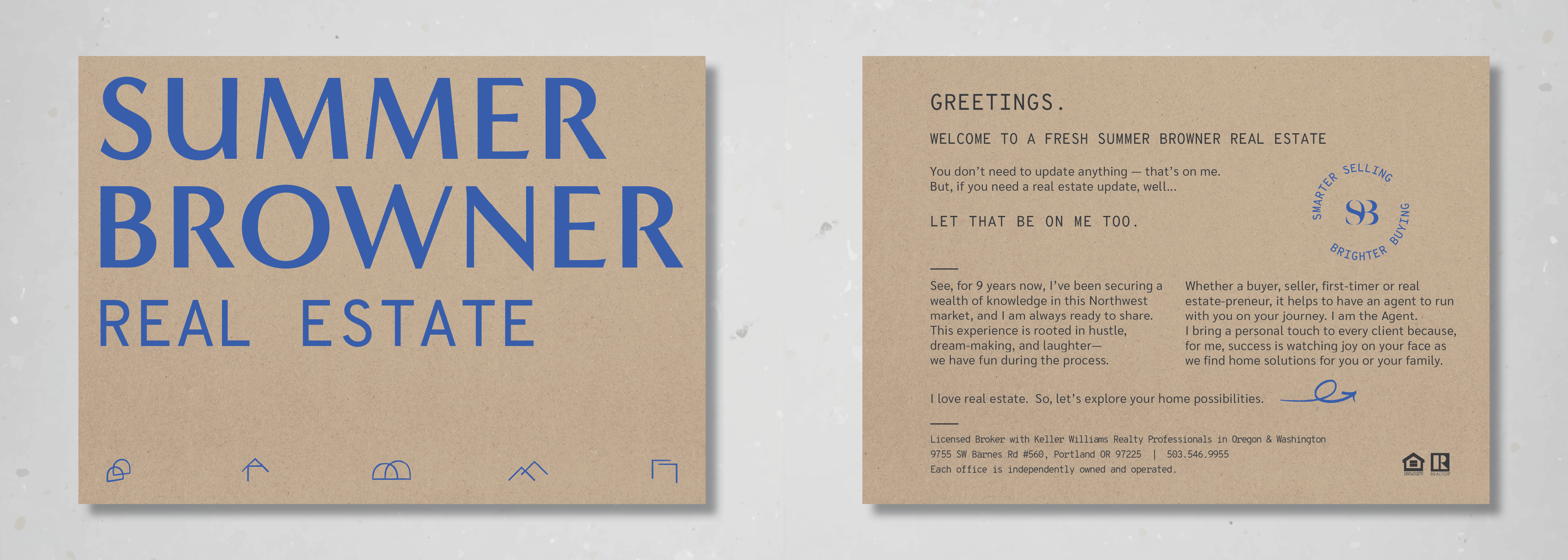
The S–B also became the baseline for her copywriting, appearing in the headline of her website, Smarter Selling, Brighter Buying - a bold, mature and assured statement of intent.