Reflect Vision Care
Charlotte & Asheville, NC — 2025
Brand Identity
Website Design
Copywriting
Signage & Wayfinding
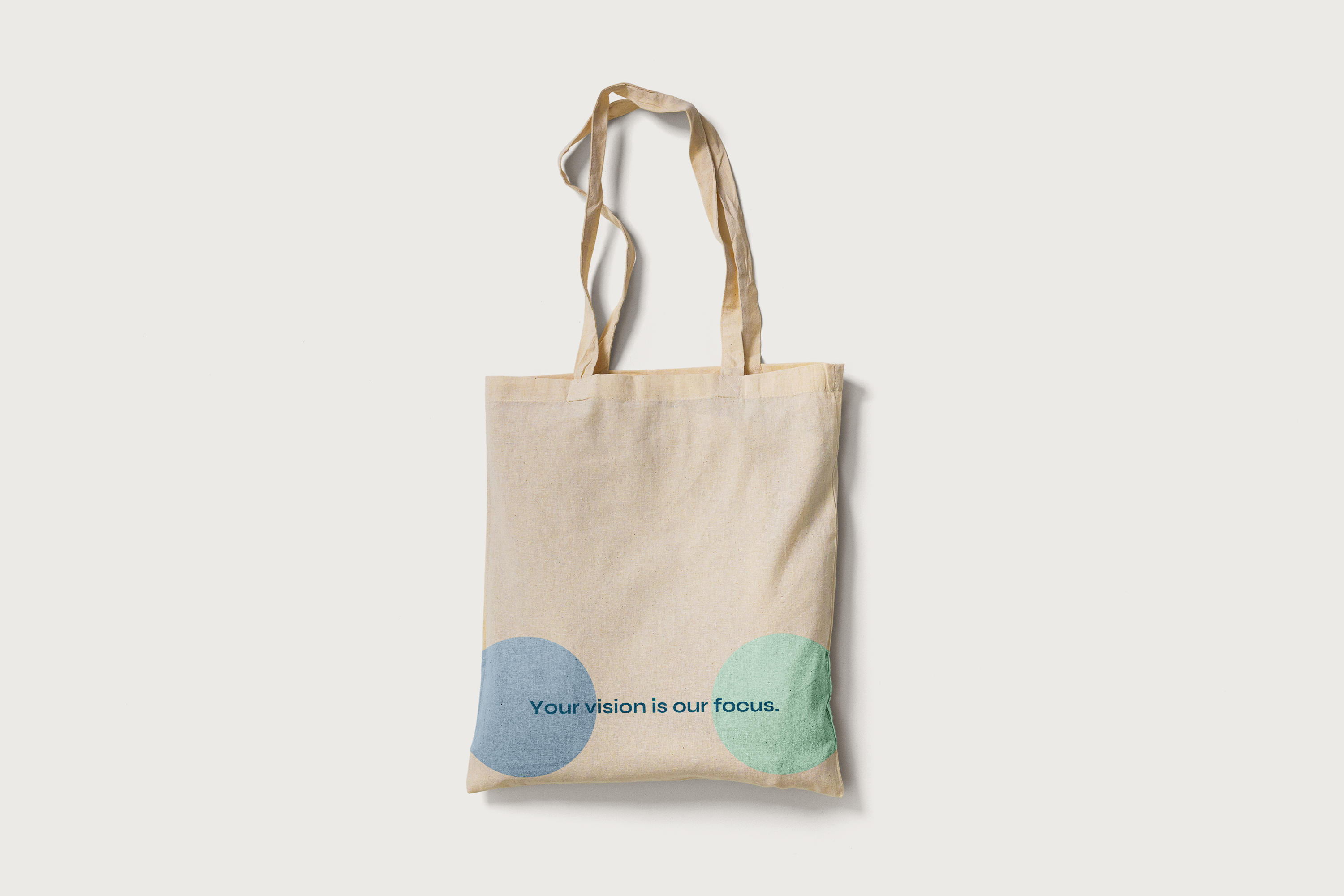
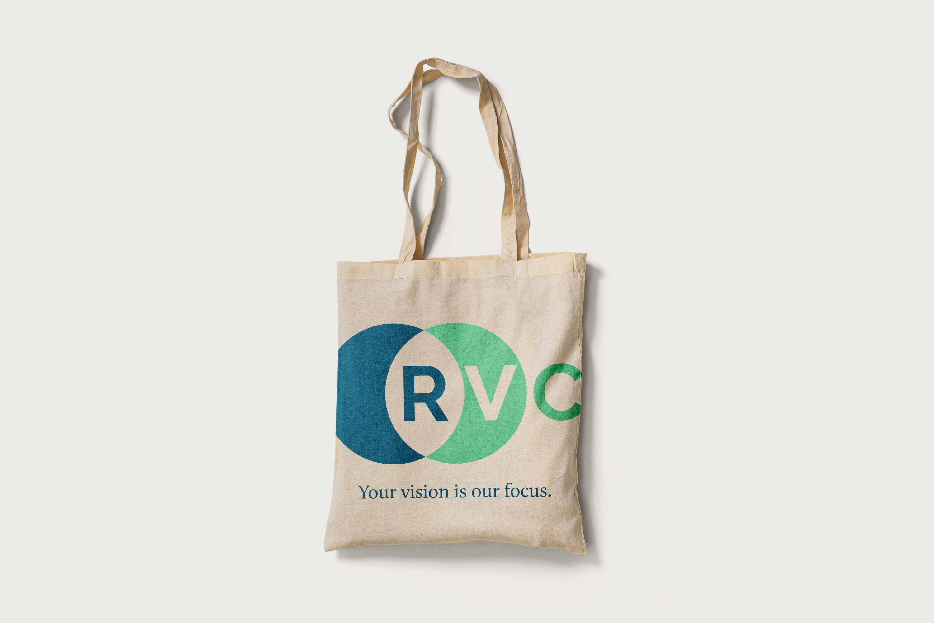
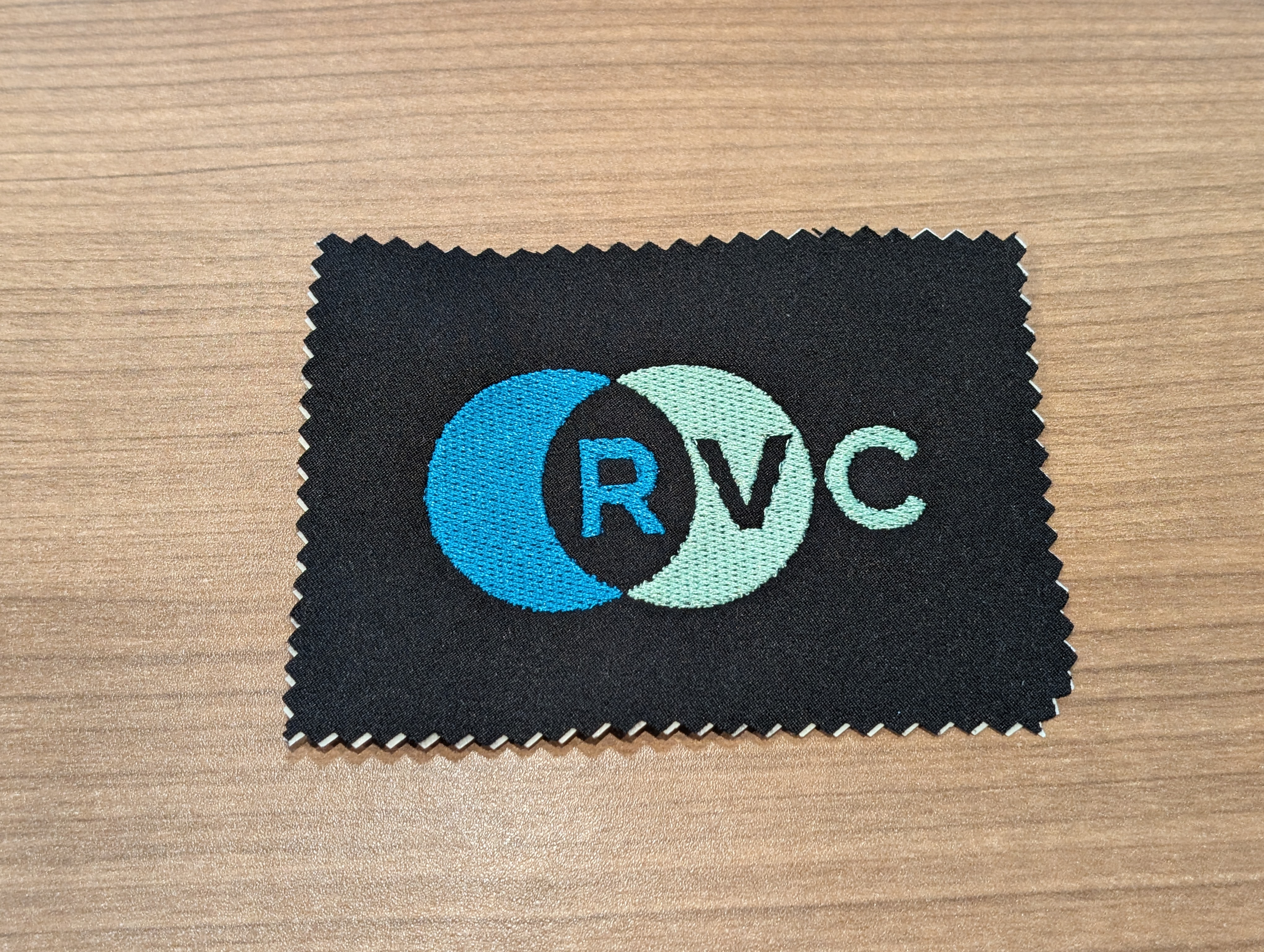
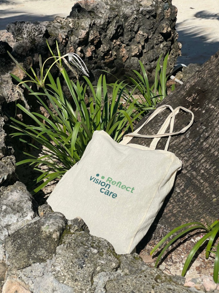
Apparel
Brand Identity
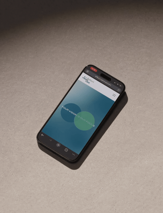
Website Design
Copywriting
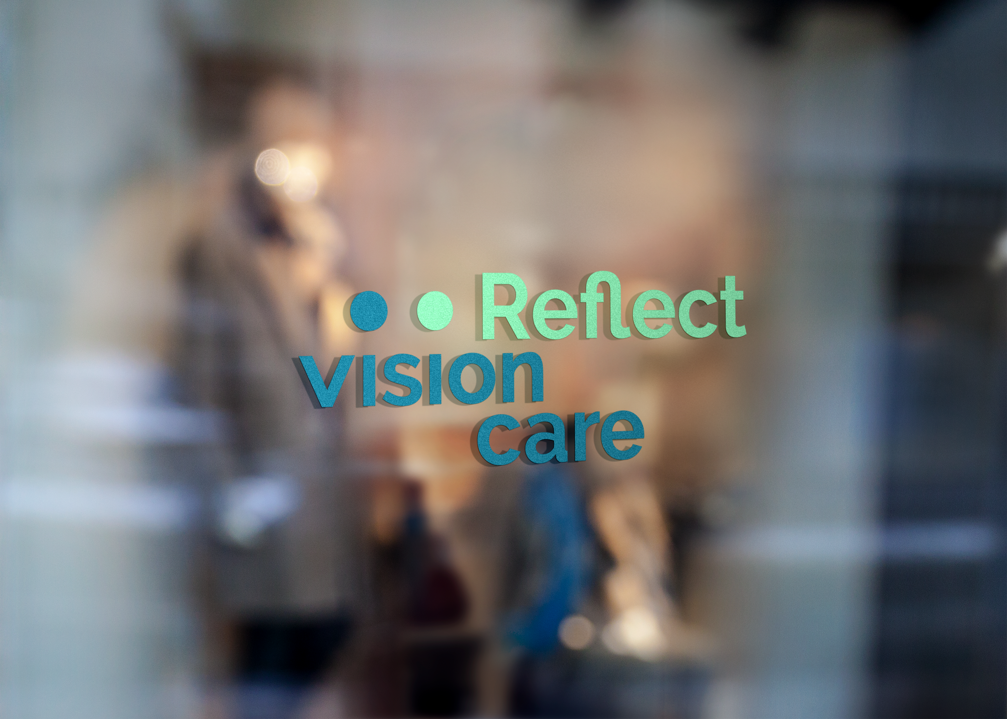
Signage & Wayfinding
Apparel
Rebranding an established eye care group with fresh attention to the customer experience.
PR Notice ︎︎︎
On The Web ︎︎︎
PR Notice ︎︎︎
On The Web ︎︎︎


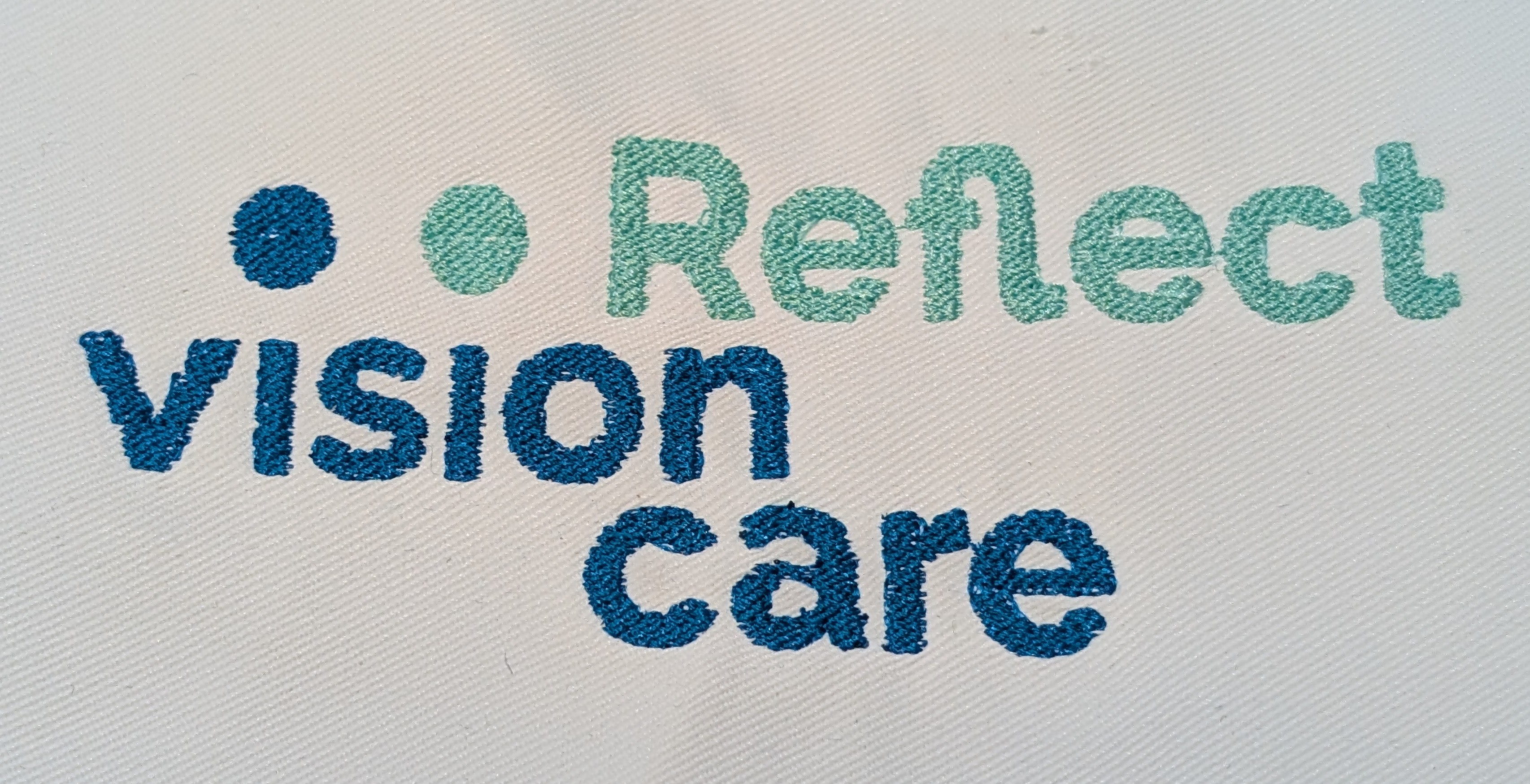
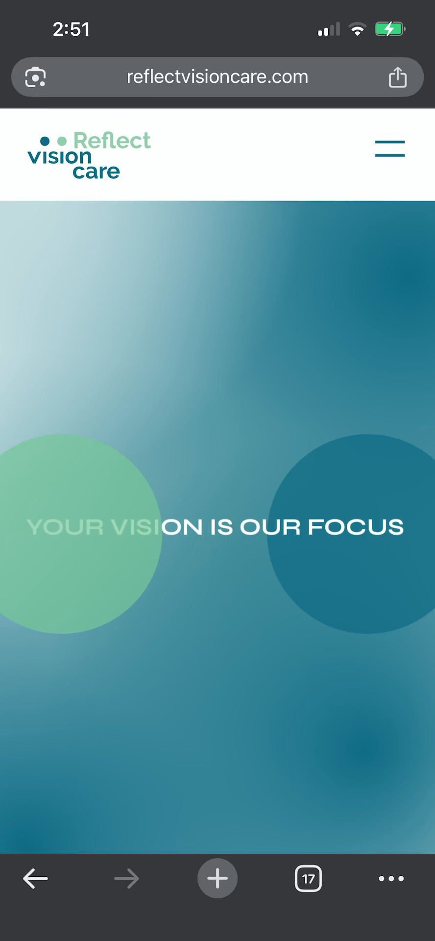
Reflect Vision Care changed its name from Northlake Eye, which Wayform helped establish in 2016. The previous name and identity was based entirely on the company’s location at this time. Since then, the company grew from one location to four and established a new ownership structure which benefited from a new name, brand identity, website, and clinic signage.
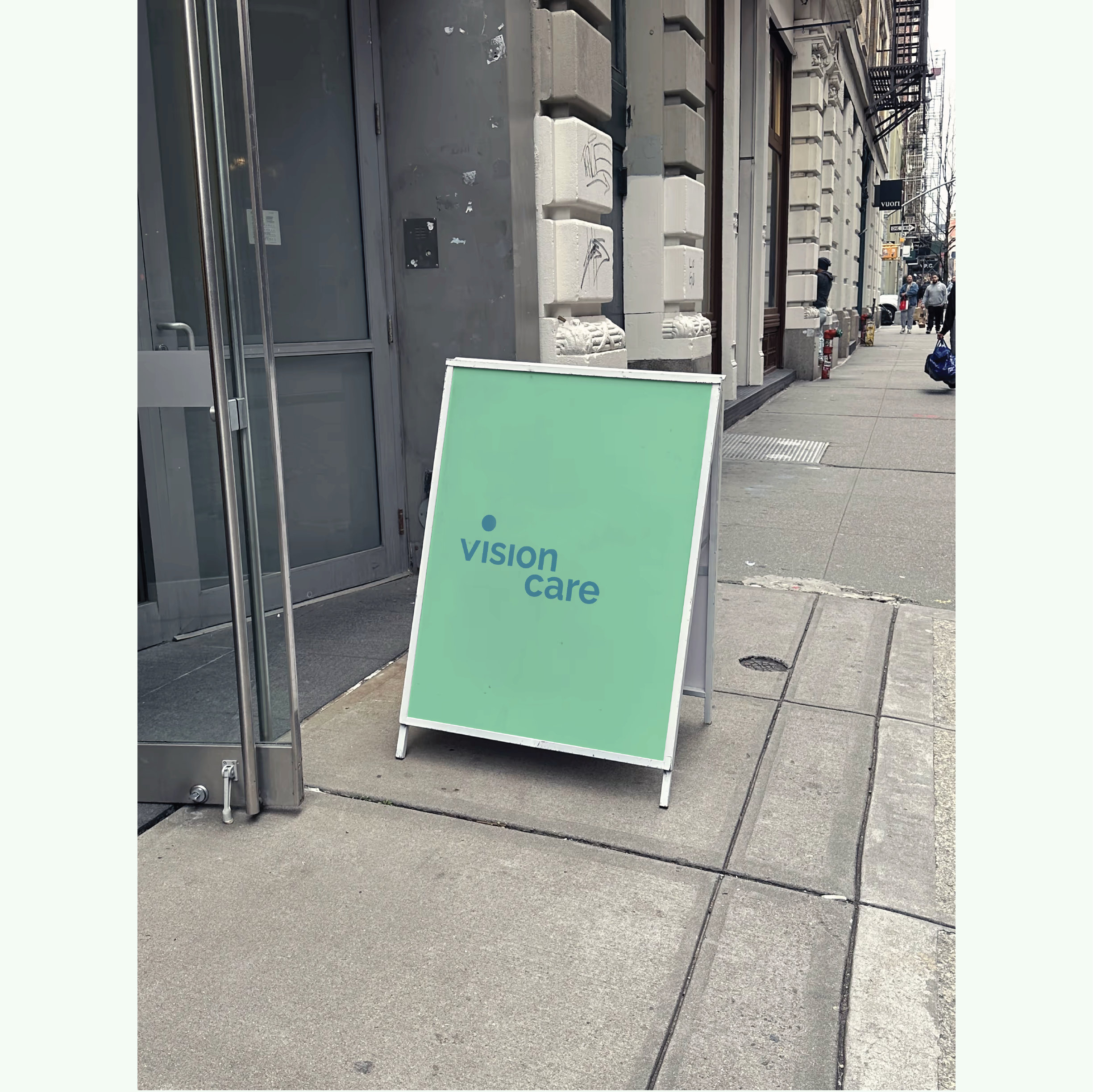
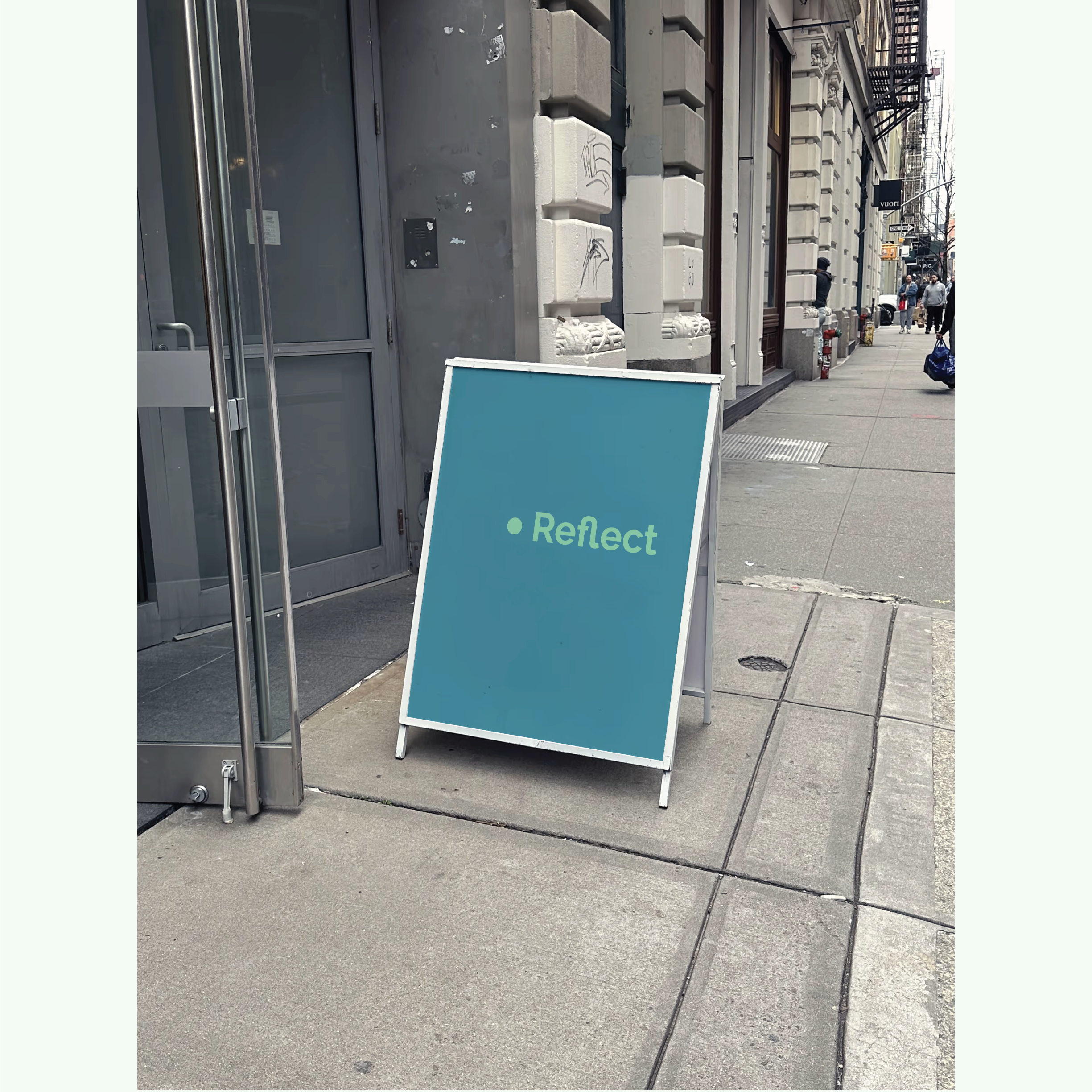
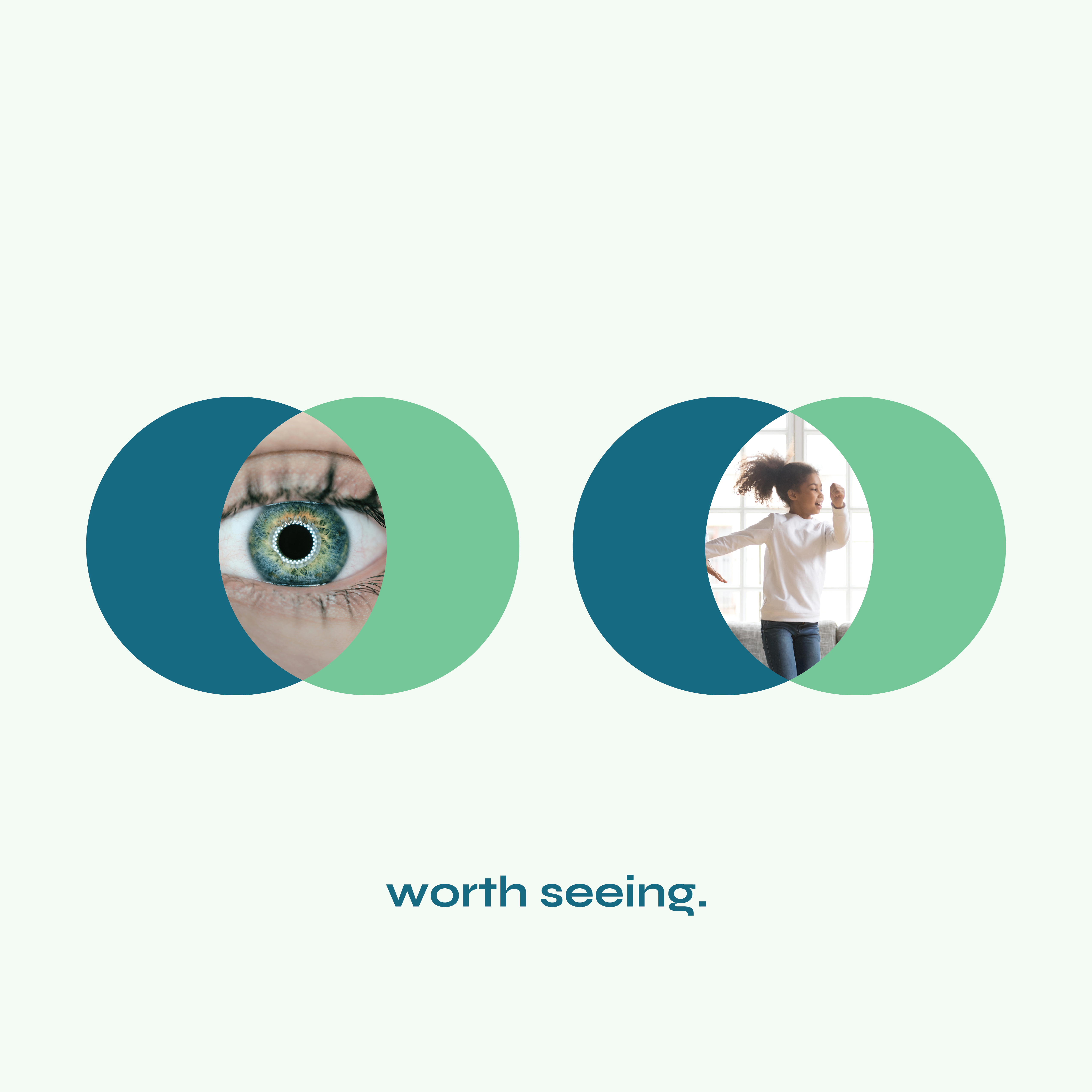
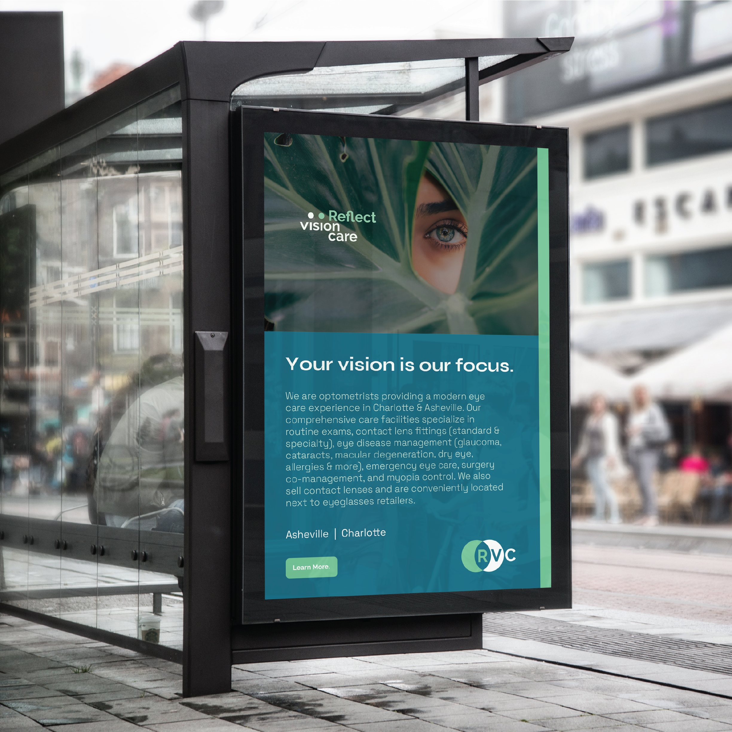
The new company name is meant to capture a more focused approach to eye care, one that provides a high level of trust and service for its customers, existing and new. This internal “reflection” is an homage to the company’s evolution and expansion and provides a visual connotation often recognized within the eye care space. Wayform helped transition the name to a new graphic identity along with new copywriting, a tagline, and fresh color palette.

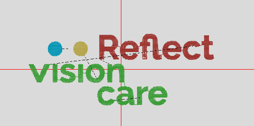
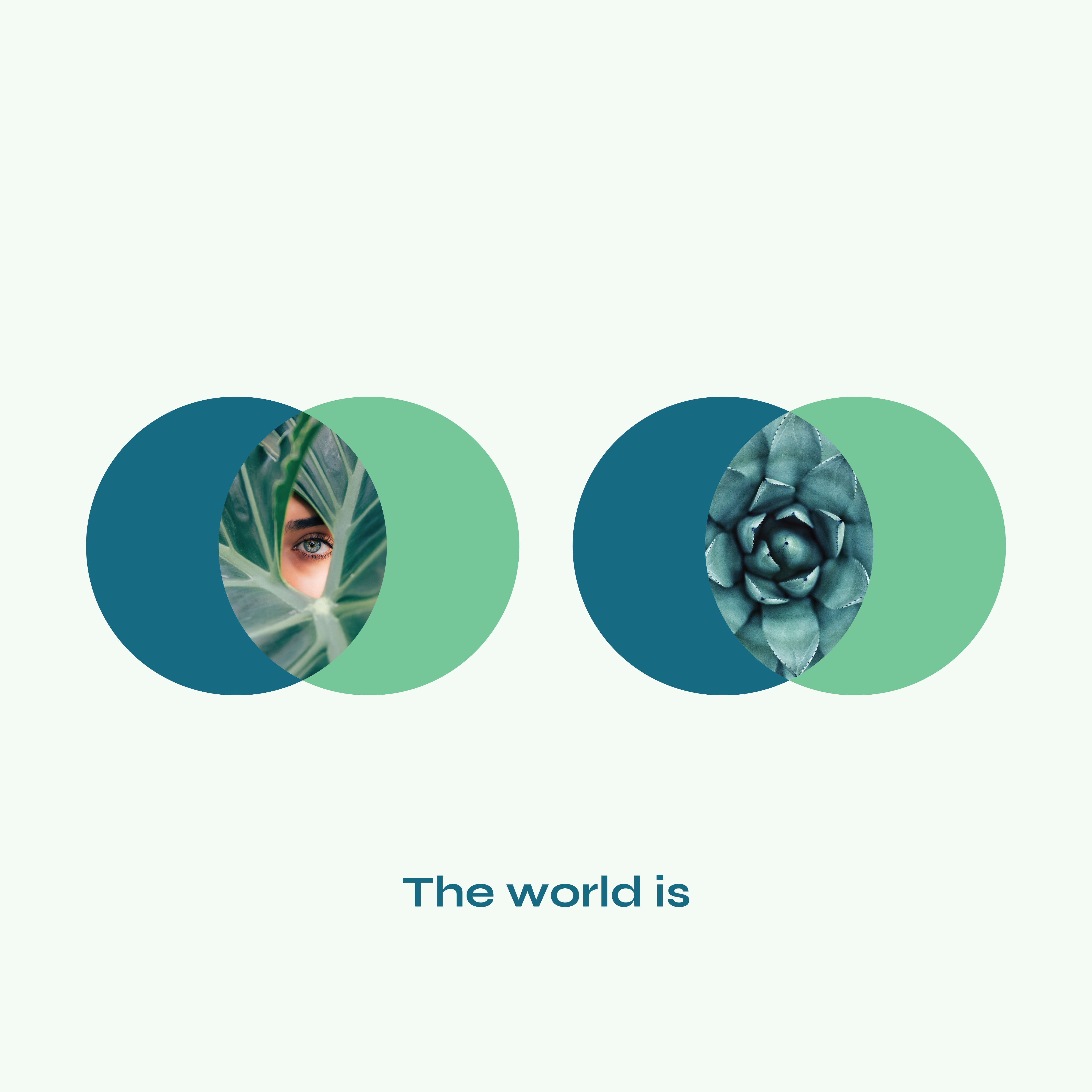
The brand strategy was very intentional to avoid (almost) all eye tropes and imagery within the identity itself and supporting visual language. In its place, the strongest geometric form – the circle – helped to not only “dot the i’s” in the word “vision” but also became the graphic representation of eyes. Whether perceived or not, the dot-eyes present the viewer with a clear and bold identity alongside “Reflect” and above “vision.” When motion graphics are introduced, these dot-eyes come to life as playful symbols of their duality as typography and eyes.